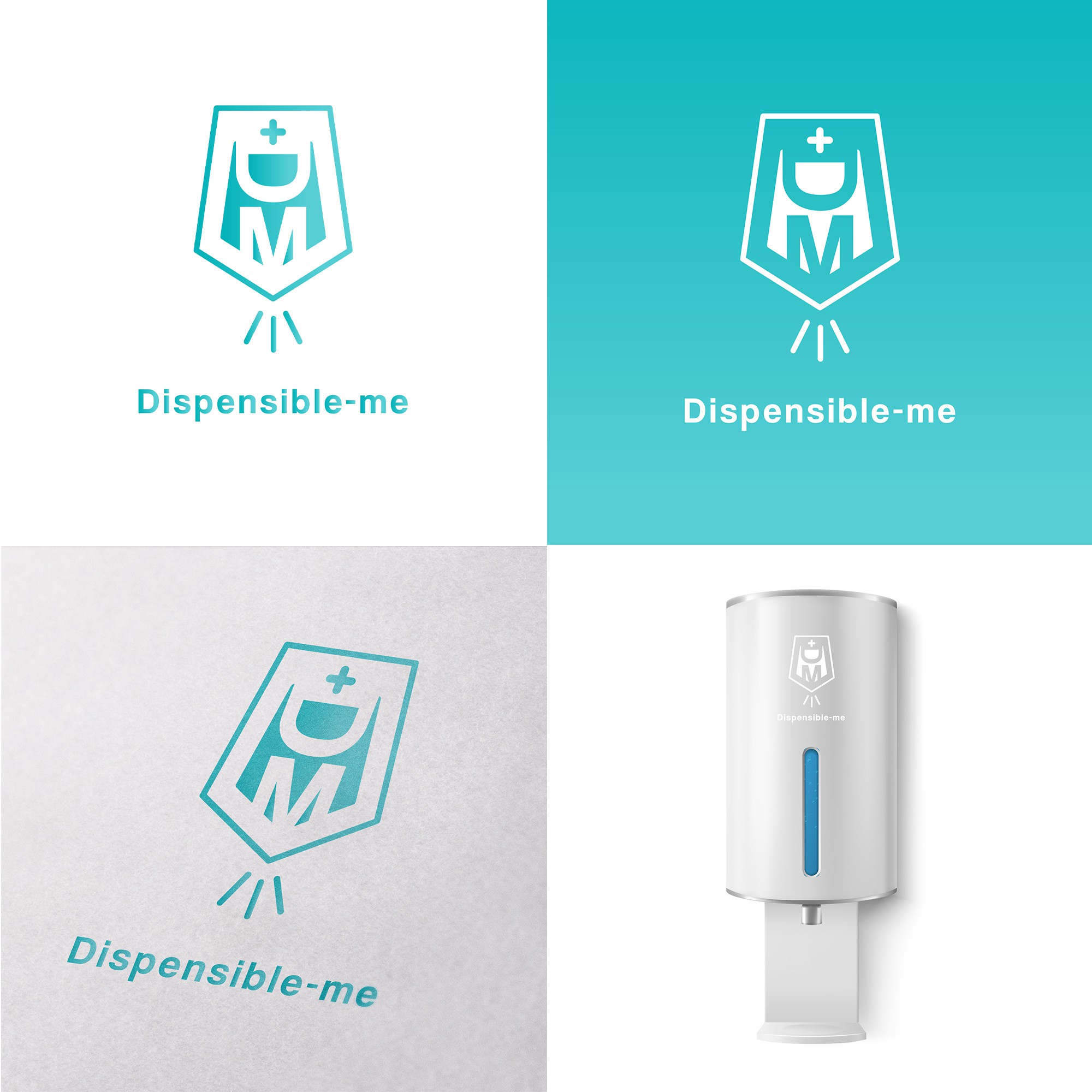

1) Shield: Protection/ Strong
2) Cross: Healthcare
3) Spray: Handsanitizer, Hygiene
3) D: Dispensible
4) M: Me
By combining these few symbolic elements with the idea of "touchless wall dispenser" for hand sanitiser,
I have come out with an eye-catchy and modern brand icon that strongly represent the brand product.
I have also included the capital letter of the brand name "D" & "M" in the middle of the shield in order to not have the icon just look like a wall dispenser but also remind and give the audience a permanent impression about the brand itself.
Typeface used for the brand name is clean and clear but board at the same time so with the "wall dispenser" look-alike icon, the whole logo is able to deliver
a clear and straightforward message of your brand to the audiences at their first
glances.
Color used is combination of white & gradient of tiffany blue which widely used in healthcare/ skincare/ toiletries products that give people a clean and
refreshing look.