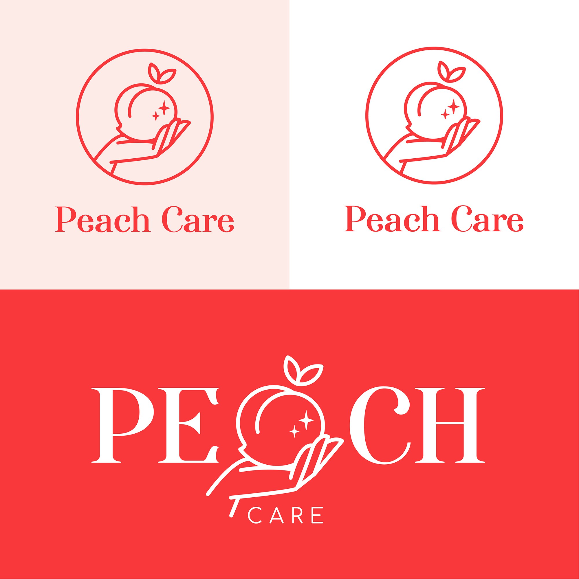

1) Peach: Brand icon ( Sweet & Feminine)
2) Hand: Caring/ Protection/ "put first"
3) Glitter Icon: Clean/ Refreshing
By combining these few symbolic elements with the idea of holding a peach on hand, I have come out with an eye-catchy and modern brand icon that strongly represent the brand product.
I have combined the peach together with a hand in order to deliver an opinion that it is important on putting the women's health and hygiene first. That also helps the audience to have a permanent impression about the brand itself.
Typeface used for the brand name is classy and formal but board at the same time so with the hand holding peach icon, the whole logo is able to deliver
a clear and straightforward message of your brand to the audiences at their first
glances.
Color used is combination of white & shades of pink which widely used in women's skincare/ toiletries products that give people a clean and
refreshing look.