Making a logo concept for an advertising agency

7
Created on 99designs by Vista
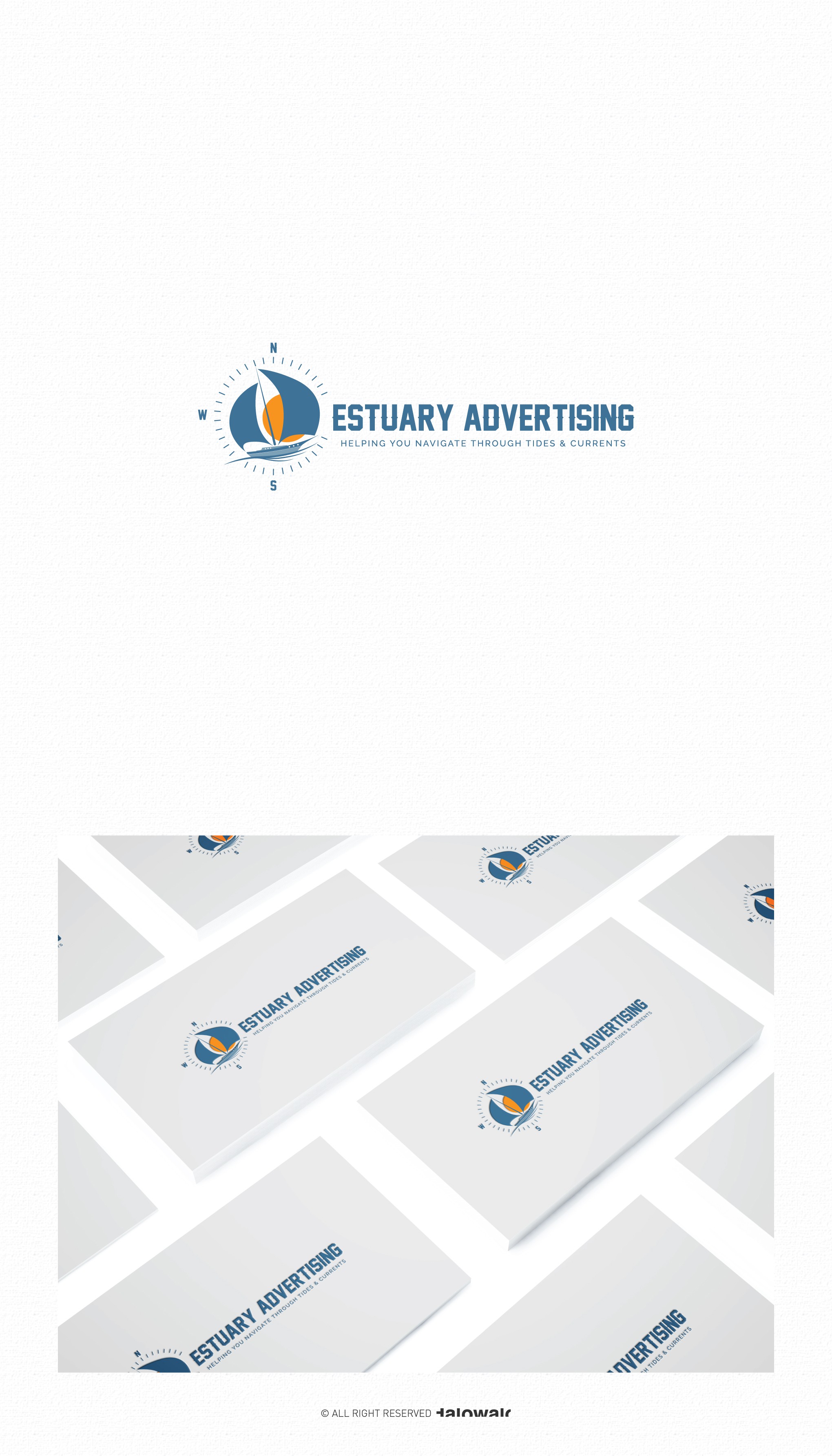
I use a sailboat shape with the sunset on the back of the boat that gives the impression of warm as well as giving a unique impression on the negative space in this logo.
I use a minimalist compass as a badges on the logo to give a balanced portion of the logo and typeface itself.
the letter E in "Estuary Advertising" represents "East" on the compass.