
Created on 99designs by Vista
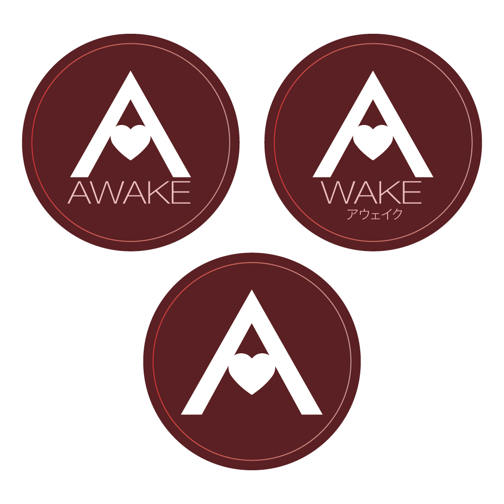
Clean logo design for a women's only reflexology and personal wellness service. Client brief included a specific desire to include a 'mountain' into the 'A'. Variation shown to use the 'A' icon as a standalone piece or an integrated piece to complete the company's spelling of the name. Japanese sub-copy used to show versatility when needed.
Note: Shades of red required by the client brief.