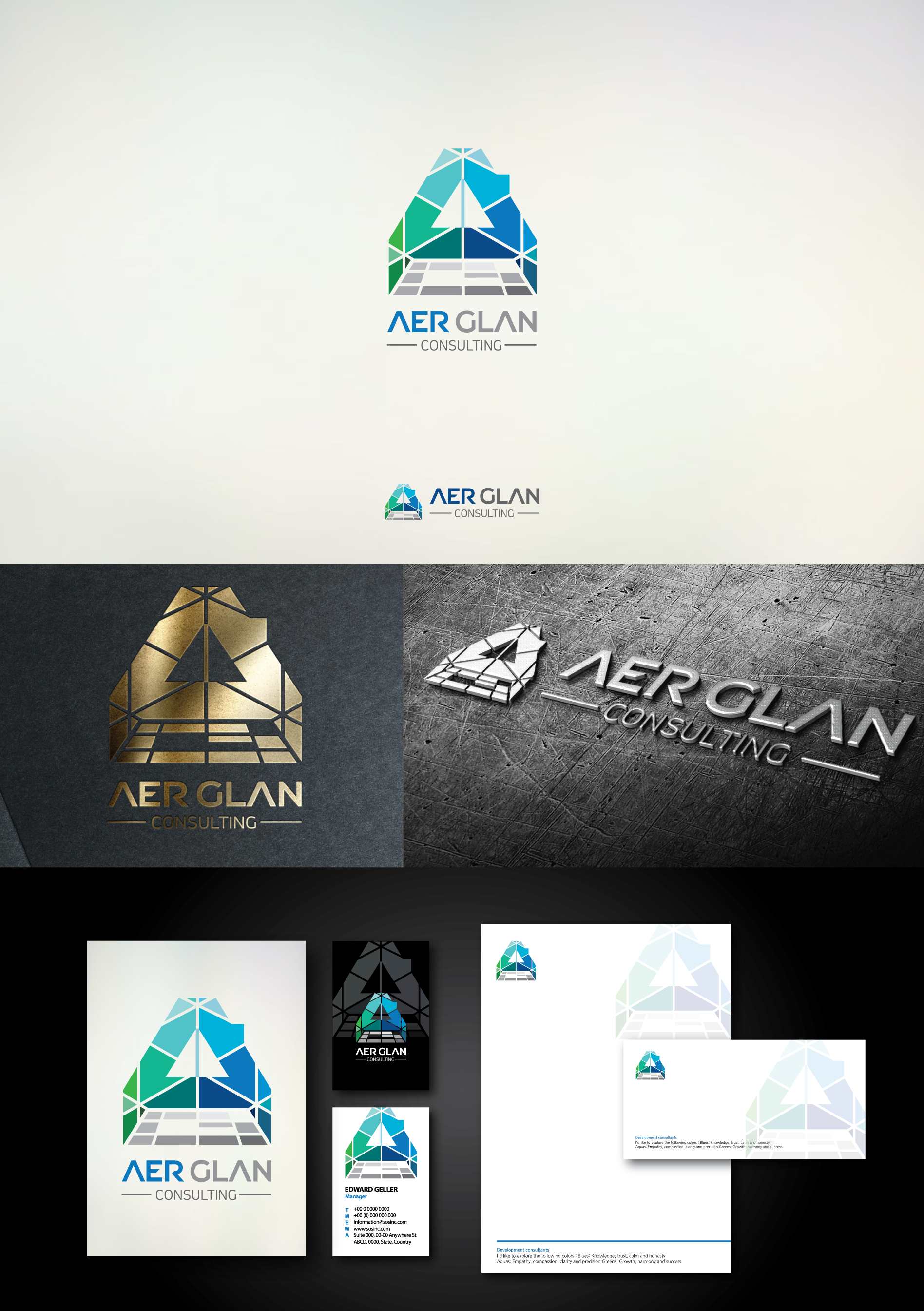
In this logo, the gap between shapes was increased, and 'G' shapes which is under the 'A' became simple structure for better recognition. Thank you!