
Created on 99designs by Vista
Hi sir,
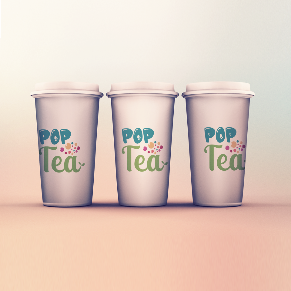
This is my design, my design concept is more for young children or teenagers who like the colors then therefore I use the colors on the bubbles and for his TEA I do not eliminate the element of tea is calm, there I make the letters TEH looks Twisted and for his icon tea I gave a leaf icon at the end of the word TEA. Then for POP I give the blue color as ice, because I know you are more selling ice tea than warm tea.
For the POP font I got it from dafont.com named Jelly Crazies
Thank You :)