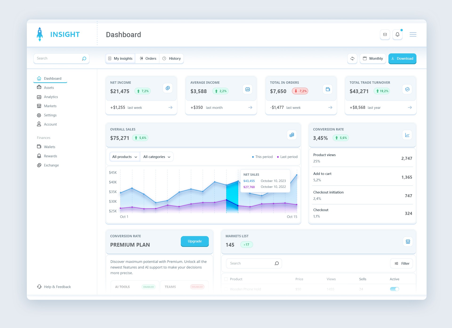

This "Insight" dashboard design is a sleek, intuitive interface aimed at providing clear financial insights. The clean layout uses a light color scheme with soft blue accents, creating a calm, professional look. Key metrics such as net income, average income, and total orders are displayed prominently, offering users quick access to essential data. The use of well-structured cards and easy-to-read typography ensures a smooth user experience. The charts visually represent sales trends, giving users actionable insights. Overall, this design emphasizes clarity, simplicity, and usability, perfect for financial tracking and analysis.