
Created on 99designs by Vista
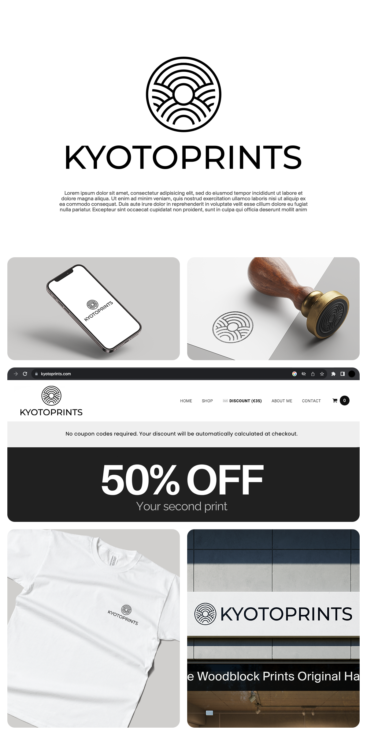
The round logogram is craft-inspired, which reminds us of the overlapping lines of a wicker. It symbolizes the craftsmanship, attention to detail, and handmade quality of the Japanese prints you offer. The rounded shape adds a touch of warmth and approachability to the logo, inviting customers to explore the artistic world of Kyotoprint.
Minimalist Typeface: The logo features the Montserrat typeface, which is known for its clean and modern aesthetic. The simplicity of the logo complements the intricate details of the round logogram, creating a balanced and harmonious overall design. The use of Montserrat typography also conveys a contemporary and stylish feel, aligning with the modern aspects of business.