New Instant Lift Beauty Landing Page

1
Created on 99designs by Vista
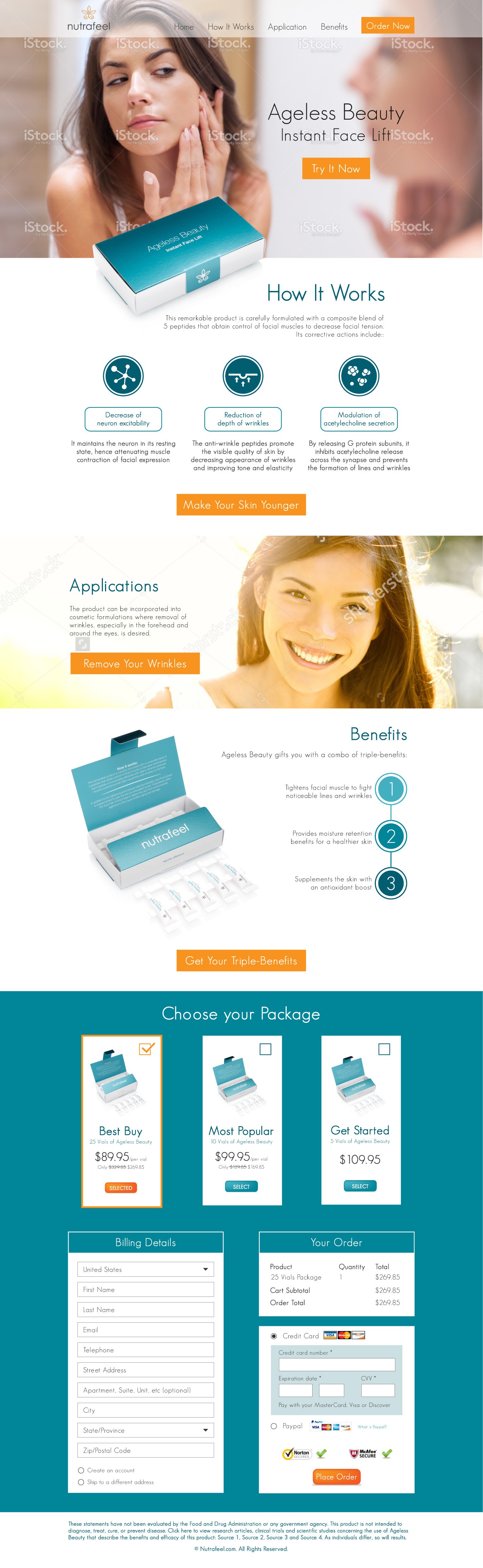
The page has been designed by considering both aesthetics and user-friendliness. The streamlined layout of the page allows a fluid linear read. Ample amount of white space has been allowed so as to not distract from the main marketing message/product. Icons (with bullet points) have been used not only to make the content easier to understand but also to engage the visitor.
Colour-wise, the cyan blue of the product has been used as main colour with occasional bright orange to attract the visitor's attention to the CTA's. The whole feel of the page evokes elegance and professionalism.