
Created on 99designs by Vista
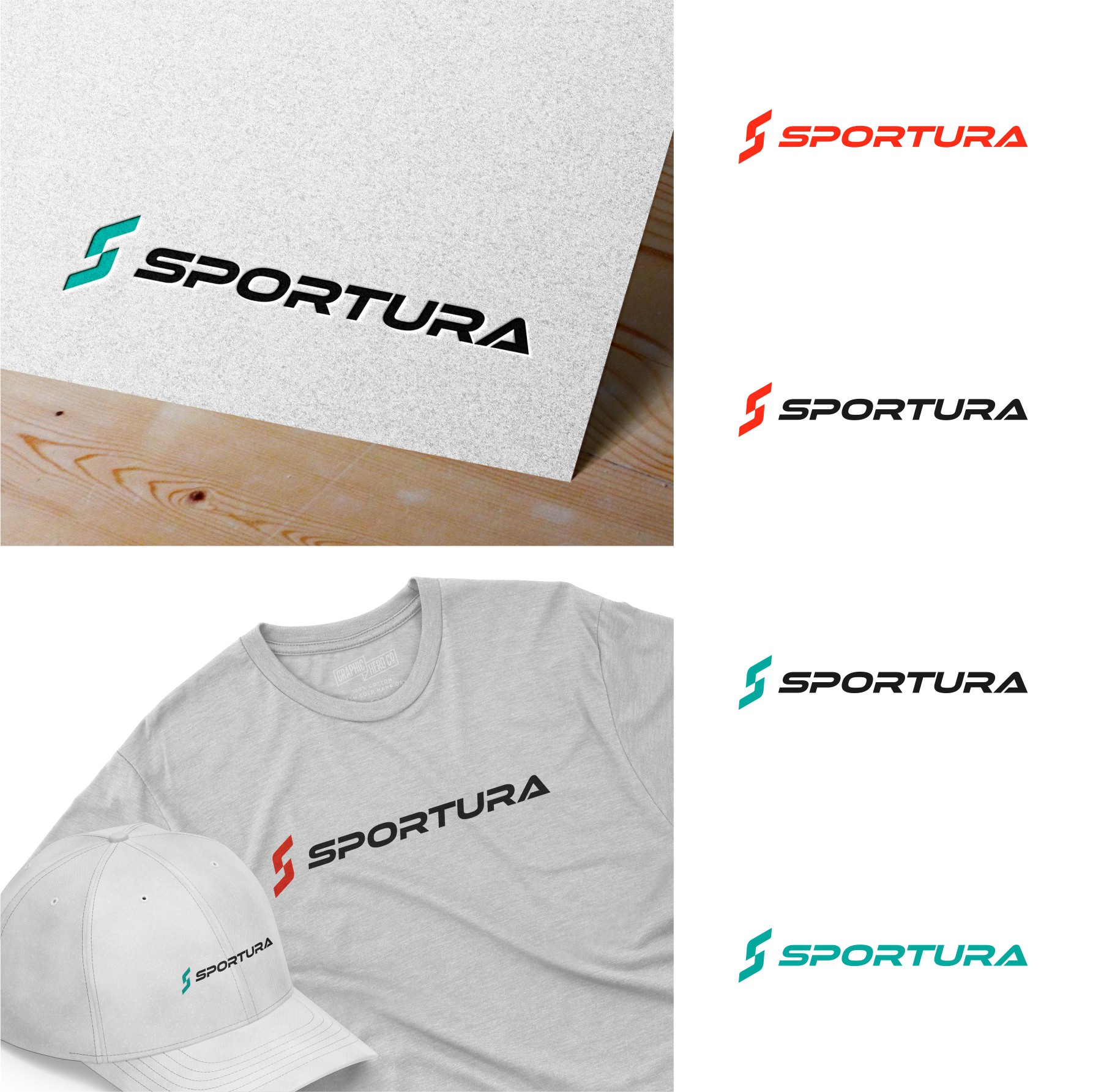
The S letter logo is a bit abstract but still easy to understand.
The combination of lines with the company's first name gives a quick impression.
The logo looks clean, modern, and professional.
There are not many details so the logo is easy to apply to any media.
Easily visible from a distance and made on a small scale.
Can use a combination of colors / one color.