Let’s design brilliant book interiors
Make that book beautiful both inside and out. Here’s everything you need to impress authors and publishers with book interiors that shine.

Interior book design is the art of creating visually appealing layouts of text and images for the inside of a book. Much of this design work falls under typesetting, the process of arranging and formatting text.
More than just gorgeous layouts and composition, great design actually provides an optimal reading experience by enhancing the text’s readability so authors can effectively communicate their message.
Before you begin
Talk to your client
We can’t stress it enough: talking to your client is the key to a successful design process. Before you even think about opening Illustrator or InDesign, ask your client these questions.
- Is your book a printed book or an eBook? Determine first whether the book interior design will be for print, digital or both.
- What’s the book genre? The book genre (fiction or nonfiction, kid’s book or cookbook) will help you understand the types of assets you’ll be working with so you can make decisions about margins, colors and font selection. For example, a novel would primarily include text, while a cookbook will be a combination of text, graphics and photos.
- Who is your publisher? Your client should already know who their book publisher will be. Remember, there are specialized publishers for both printed book and eBooks. We’ll get to those details below.
Get your assets
Your client needs to provide
- The book cover
- Manuscript
- Page size
- Images to include
- Preferred fonts

Printed book interiors
A printed book interior is the set of physical pages for a book you could purchase in the store. Books come in all shapes and sizes, so there’s a wide variety of “standard” dimensions. Luckily, your client should already know what they need. Contact them directly and ask them to send a template from their publisher.
Three of the most popular publishing companies for printed books are:
Three of the most popular publishing companies for printed books are:
Start with a template
Your client should send you a template. Use their template to complete your designs. If you have questions, don’t be afraid to reach out to your client or have them get you in touch with their publisher directly.
If no template is available, contact your client to get as many specifications as possible, including dimensions and printing requirements. The more information you’re able to get, the fewer revisions you’ll have, and you’ll be able to deliver a better design.
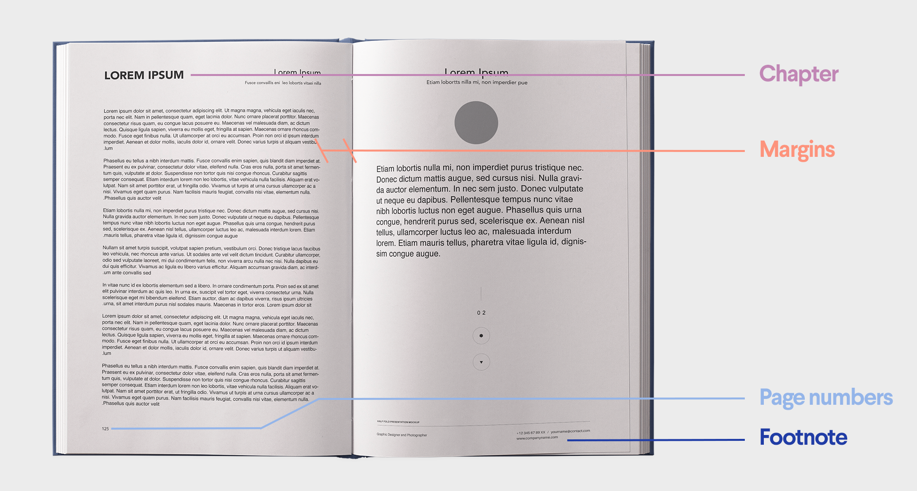
Components of a printed book interior
Things to remember
Before you hand-off files to your client, double-check the following:
Be consistent: Make sure all of your styles match. You need to have the same chapter headers, paragraph styles, running head and end-of-chapter elements throughout your design.
Hyphenate: Make sure no words break off at the end of lines.
Remove print marks: Delete all print references (e.g. trim, bleed and safety lines) from your final files.
Optimize images: All images must be suitable for printing, which typically means a 300dpi resolution.
Submitting to your client
Once your client has approved the final design, send them all of the design files. Here’s what they need:
- An editable version of the final design (PDF, INDD)
- All web preview images (JPEG or PNG)
- A link to purchase any commercial fonts or images used in the design

eBook interiors
An eBook is an electronic book that is distributed and can be purchased through an online publisher. Each publisher has its own own size requirements, so contact your client directly to determine where they plan to publish their book. Once you know the publisher, you’ll be able to determine the correct requirements for your design.
Some well-known publishers for eBooks include:
- IngramSpark
- Kobo
- Amazon Kindle
- Nook Press
- Apple iBooks
- Google Books (currently not accepting new customers unless you are an existing partner)
- Book Baby
Start with a template
Your client should send you a template. Use their template to complete your designs. If you have questions, don’t be afraid to reach out to your client or have them get you in touch with their publisher directly.
If no template is available, contact your client to get as many specifications as possible, including dimensions and printing requirements. The more information you’re able to get, the fewer revisions you’ll have, and you’ll be able to deliver a better design.
If no template is available, contact your client to get as many specifications as possible, including dimensions and printing requirements. The more information you’re able to get, the fewer revisions you’ll have, and you’ll be able to deliver a better design.
Components of an eBook interior

Types of eBook layouts
-
 by Victor German
 -
by NessaD.


Reflowable
Reflowable layouts adapt to different devices or apps.
- This format enjoys wider distribution.
- Readers can change font size, margins and spacing.
- This format makes it easier to create - and therefore cheaper!
- Authors have little control over the presentation of their eBook
- Most common reflowable file types are Mobi and EPUB.
- Best for novels and non-fiction titles with minimal images
Fixed layout
Fixed layouts have specific layouts that are compatible with select reader devices.
Fixed layouts have specific layouts that are compatible with select reader devices.
- This option works well with image-heavy publications and multi-column texts.
- Authors get better control over the way their eBooks are presented.
- Readers don’t have control of their reading behavior (e.g. adjusting font size).
- Most common fixed-layout formats: EPUB3 and KF8
- Best for children’s books and nonfiction titles like cookbooks.
Things to remember
Before you hand-off files to your client, double-check the following:
Be consistent
Make sure all of your styles match. You need to have the same chapter headers, paragraph styles, running head and end-of-chapter elements throughout your design.
Optimize images
All images must be suitable for printing, which typically means a 300dpi resolution.
Use page anchors
In a reflowable layout, use page anchors instead of page references. Make sure all links go to the intended anchors before you export. If you’re working with InDesign, do this by clicking Window > Interactive.
Page numbers
For eBooks, the table of contents needs to be coded separately. Use an EPUB editing app to add a table of contents section.

Submitting to your client
Once your client has approved the final design, send them all of the design files. Here’s what they need:
- A downloadable and readable version of the final design on devices (EPUB3 for fixed layout; EPUB for reflowable layout)
- An editable version of the final design (PDF, INDD)
- All web preview images (JPEG or PNG)
- A link to purchase any commercial fonts or images used in the design
The design checklist
Great design never came from following rules. So, break ‘em! Except for these. They’re pretty important. Stick to these guidelines to ensure your text, images and layout are perfect.
- Never use Microsoft Word to design a book interior. Word is not built for book layouts (and the client could easily do this themselves). Instead, use dedicated programs like InDesign or ePub.
- Pay attention to your margins. Small margins may fit more words into one page, but you’ll have a messy layout. Use the same inner and outer margins for a great-looking interior.
- Play around with different fonts. Certain fonts can help you fit more words into one book page.
- Watch your center. Books do not open completely flat, and text may curve into the binding. Adjust your margins and align your text properly so it will always be visible.
- Prep your files! Account for your bleed, margin and trim lines when preparing a printed interior, but erase the lines before sending them to the printer.
- Select appropriate font sizes. These are typically 11-12 pt for old-style fonts like Garamond or Palatino. Larger fonts can look like children’s books, while smaller fonts can be illegible.
- Limit the amount of different fonts you use to a maximum of three. Too many fonts will distract your readers from your text.
- Check for widows and orphans in your paragraph layouts. Adjust the spacing before and after paragraphs or pages to eliminate them as much as possible.

The dictionary of design
CMYK and RGB... Droids from Star Wars, right? Design lingo can be a little tricky, but we can translate. Here are some design terms you’ll need to know.
Color mode
How colors are represented in your design
- CMYK: An ink-based mode used in print
- RGB: A light-based mode used on-screen
-
by CANDesigner
-
by annanyang


Manuscript
The content of the book to be fit into the book.
Margins
White space that surrounds content
- Gutter margins: The margin on the inside of bound pages that needs to be generous to compensate for the binding process.
- Outside margins: The margins on the opposite side of the gutter margins. It can be of the same width or narrower than the gutter margin.


Print guidelines
Measurements to ensure top-notch printing
- Trim Line: Where the printer will cut your image
- Bleed: The area beyond the trim line that extends printing to the edge
- Safety Line: The border that contains all printable text
-
by johnHE
-
-


Resolution
The amount of pixel detail in an image
- Low resolution: Few pixels make the image pixelated
- High resolution: Many pixels make the image sharp


Running head
A heading printed at the top of each page of a book or chapter.
Saddle stitch
Thread-stitching or a wire staple passed through the fold of a book.
Typesetting
Arrangement of type of the text to ensure the readability of a book.
Widows & orphans
Dangling words that start or end a paragraph
- Widows: A paragraph-ending line that falls at the beginning of the followign page or column.
- Orphans: A paragraph-opening line that appears by itself at the bottom of a page or column.

